Type Effects
For this week's project, I was tasked with creating different designs using text effects. Here are my designs!
Inspirational Posters
The first thing I was tasked with doing was creating three inspirational posters using the words creativity, money, and photoshop.

Creativity Poster
The first word I created a design for was "Creativity". I used the spray paint text effect tutorial to learn how to make the effect. I used inner glow, outer glow, brush effects, and color overlays to get the final product.
Money Poster
The next word I made a poster for was money. For this one, I used the watercolor text effect tutorial to learn how to make the effect. I used pattern and color overlays, as well as drop shadows and brush touch ups.


Photoshop Poster
For the last poster I made it based off of the word photoshop. I used the metal text effect tutorial to learn. In the end, I used gradient, pattern, and color overlays, as well as drop shadows, stroke, inner glow, warp effects, and outer glow to get the final image.
Name Text Effects
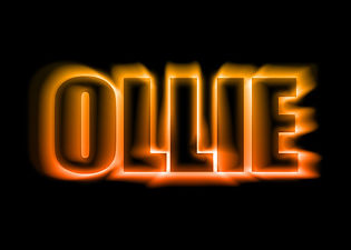
The next thing I did was use text effects to spice up a couple names. The first being mine, and the second, my dog's. Both of the effects I used came from the website, "70 Photoshop Tutorials For Creating Perfect Typography". The first was my name, "Paige". I used the effect entitled, "Suspended Text Effect". I used inner and outer glow, blur effects and text warp to create the final image. The next was my dog's name, "Ollie". I chose to use the "Colorful Light Burst Text" effect because I feel like it accurately describes my dog's personality. He is bright and cheerful, but he also is very loud and comes right at you in a good way. I used blur effects, outer and inner glow, as well as effects under the stylize panel.


Chalkboard Effect
For this effect I sketched out a design on paper before scanning it and sending it into photoshop. I used a chalkboard image as the background and then used the screen blending option on the design. I brightened it up a bit and then adjusted the color of the design using hue and saturation.
Typographic Portrait
Lastly, I made a portrait using text effects. I chose the picture first and then used hue, saturation, brightness, and contrast to make the image look better. Then I made a paragraph of text and used the displace filter under the distort category and made a clipping mask for the final image.
